
Key Takeaways
- Mobile-first design is crucial because most people use smartphones to browse the internet.
- It helps improve website speed and boosts your search engine ranking.
- It ensures your site is accessible, user-friendly, and adapts smoothly to larger screens.
- Starting with mobile design is a smart way to meet modern user needs and keep up with trends.
We are living in the era of mobile phones. According to 2024 statistics, almost 7 billion people use mobile phones worldwide. That’s 90% of the world’s total population. Interesting, right? So, as a business website owner, can you look over the importance of a mobile-first design? No!! We don’t recommend that.
Let’s discuss the prospect of a mobile-first design in detail.
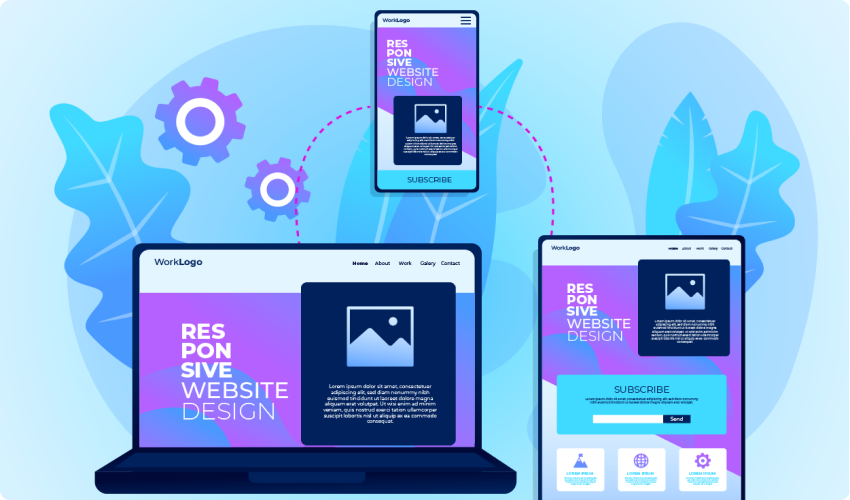
What is a Mobile-First Design?
The first wave of mobile-first design appeared in 2010. It started when Google’s CEO announced that all website development should be ‘mobile-first’. Now, what does it even mean? Mobile-first design is designing websites or apps to make them work well on mobile devices. We usually start with the design for a computer screen and then adapt it for mobile. But here, you start with mobile devices first.
This approach makes your design look great and function smoothly on smaller screens. It’s all about putting mobile users’ needs first to create a better experience.
What are the Phases of Mobile-First Design?
The phases of mobile-first design ensure that a website or app works perfectly on mobile devices before adapting it for larger screens. Here’s a simple breakdown of these phases:
01.Research and Planning
Understand what users need and how they interact with your mobile site or app.
Sketch what you want to achieve with your design. Improving user experience or increasing engagement?
02.Wireframing and Prototyping
Sketch basic layouts for mobile screens to outline the structure and elements. Develop interactive prototypes to test the flow and usability of the design on mobile devices.
03.Design and Development
Focus on creating a clean, user-friendly design that works well on small screens. Put important content and features first.
Write code and build the website or app to function on mobile devices before adapting it for larger screens.
04.Testing and Optimization
Check how your design performs on different mobile devices to ensure it looks and works as intended. Make any necessary adjustments to improve loading times and overall performance on mobile.
05.Adapt for Larger Screens
Gradually adjust the design for tablets and desktops, ensuring that the user experience remains smooth and effective on larger screens.
06.Launch and Monitor
Make your mobile-first design live for users. Continuously gather user feedback and analyze performance to make ongoing improvements.
These phases help ensure your design is user-friendly and effective on mobile devices. It still provides a smooth user experience for desktop and tablet users.
Benefits of Mobile-First Rule in a Product Design
Let’s understand why your business, be it online or offline, needs a mobile-first design:
01.Mobile Dominance
As of 2024, about 62% of global web traffic comes from mobile devices. For example, websites like Facebook and Instagram see most of their traffic from mobile users.
Designing for mobile first ensures that most users have a good experience.
02.On-the-Go Use
People often check their phones while commuting or waiting. For instance, 79% of smartphone users purchased stuff using mobile phones in the past six months. It shows how important it is to design for mobile users who are on the go.
03.Faster Load Times
Google found that 53% of mobile users will leave a page that takes longer than 3 seconds to load. Mobile-first design helps speed up loading times by focusing on content and optimizing resources.
04.Efficient Resource Use
The mobile-first design encourages the use of smaller images and faster-loading scripts.
For example, a site like Amazon, which has millions of users, ensures fast performance on mobile to keep users engaged and shopping.
05.Prioritization of Content
When designing for mobile, you must first prioritize what’s most important.
For instance, Twitter’s mobile app focuses on a streamlined feed and interactions, which improves usability and keeps users engaged.
06.Clarity and Usability
Mobile-first design reduces clutter. For example, Airbnb’s mobile app is simple and easy to navigate. It makes it clear for users to book accommodations without being overwhelmed by extra features.
07.Responsive Design
Starting with mobile ensures that designs work well on all devices.
For example, Google’s mobile-first index ranks sites based on their performance on mobile devices. A site like Apple’s has a responsive design that adapts well from mobile to desktop.
08.Accessibility
Mobile-first design often includes touch-friendly features. For instance, the YouTube mobile app is designed for easy scrolling and tapping. It increases the user experience for touchscreen users.
09.Adapting to Trends
Mobile usage continues to rise. Statista reports that mobile internet usage accounts for over 60% of web traffic in 2024. Designing with this trend in mind helps ensure your product remains relevant.
10.Scalability
Mobile-first design allows for easier scaling to new devices. For example, Netflix’s mobile-first approach means their app works smoothly on various screen sizes, from phones to smart TVs.
11.Search Engine Ranking Boost
Google prioritizes mobile-friendly websites in search results.
Sites with mobile-first design often rank higher in search results. Mobile usability is a key factor in Google’s ranking algorithms. It can lead to more visitors finding your site.
Get a World-Class Mobile-first Design!
You need to have an online presence if you are a business owner. And for that, a responsive mobile design is the first thing to get. SysInn can help you big time. Our team of experienced developers and designers can create a magical online presence for you


